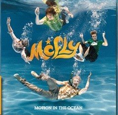
 I know I just posted for the night, but when I saw this, I had to post it: the new artwork for McFly's album cover.
This really isn't a McFly-dedicated blog, I swear.
Well, the album cover certainly is...eye-catching. If nothing else, it does show why they changed their logo--the very blocky look of the old one wouldn't really have fit in underwater. I'm sure it will probably get panned, but it sort of fits with the sound of their recent songs and has the whole goofy vibe McFly seem to be going for lately, so in an odd way, I think it works. Tom's looking rather pale, though.
(For a different take on it, you could look at this comparison--not my work)
They just shot their video for "Star Girl"--for pictures from the shoot, go here (they are not mine, though--full credit to the person whose PhotoBucket account it is). Danny seems to have foregone the hair straightener.

3 comments:
you know, before i even read it, i thought tom looked pale. i wanted to pack him off to the sun with some lemsip to help him perk up a bit. that said, as mcfly can do no wrong in my book, i love the cover. i think its quite groovy
Okay, level with us.... you slept each one of them, didn't you.
No, just one ;) I'll let you guess which, though.
Post a Comment